01 Homepage
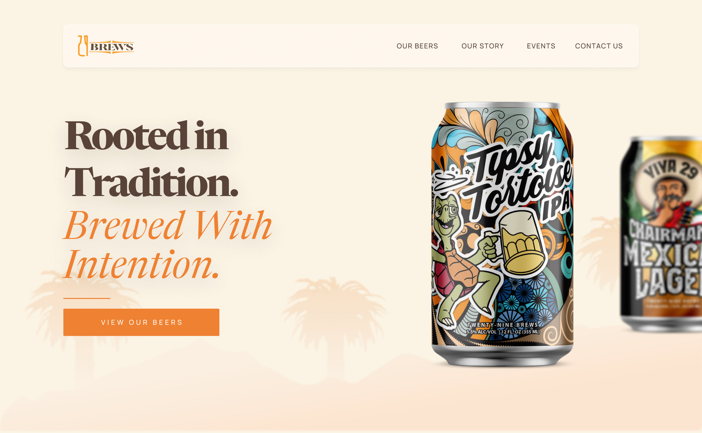
Rooted in tradition
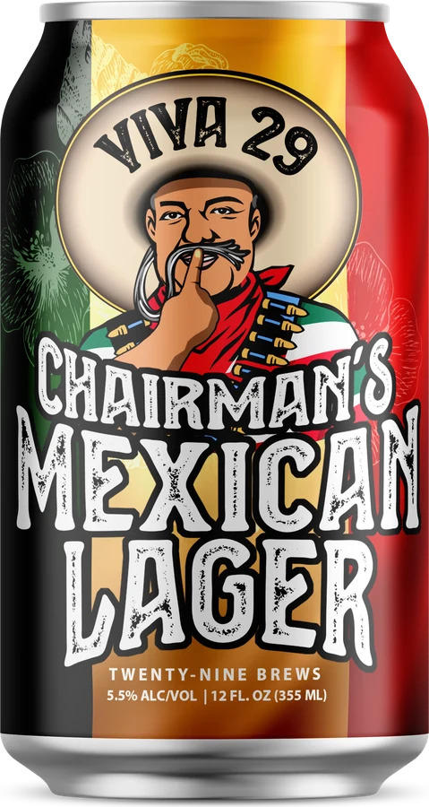
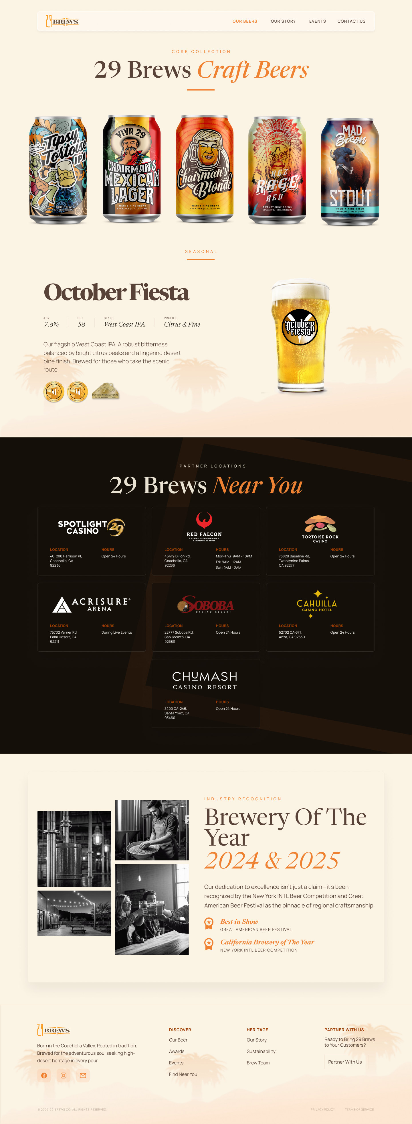
The first screen leads with the brand promise and the cans, with a single clear call to action: view the beers.
A research-led redesign of the 29 Brews website for the Twenty-Nine Palms Band of Mission Indians: helping taproom visitors choose a beer with confidence and turning the partner sales deck into an interactive B2B experience.
29 Brews brews its beer for Taproom 29 inside Spotlight 29 and Tortoise Rock casinos. The goal: put users first with a design-thinking approach, aligning business goals (telling the brand story, driving taproom visits) with user needs (easier beer selection, clear information), across two sites. The B2C site serves drinkers; the B2B site replaces the sales deck for bars, restaurants and distributors.
Mostly 30+ Coachella Valley residents who visit Spotlight 29 for dining and entertainment.
Not craft-beer experts. They pick familiar, approachable styles and lean on staff recommendations to decide.
Bars, restaurants and distributors who need specs, brand story and marketing support to confidently carry the beer.
A 20-minute session with the brewmaster on vision, brand identity, tribal heritage, popular beers and where the product is sold.
15–20 minute conversations with 2–4 participants: casino visitors, Coachella Valley residents and occasional 29 Brews drinkers, covering beer discovery and website expectations.
A UX review of 3 local breweries (Las Palmas, Coachella Valley, La Quinta) and 4 national ones (New Belgium, Dogfish Head, Stone, Sierra Nevada).
How the current 29 Brews site compares with 7 breweries across 14 UX features.
| Local | National | |||||||
|---|---|---|---|---|---|---|---|---|
| 29 Brews | Coachella Valley | La Quinta | Las Palmas | New Belgium | Dogfish Head | Stone | Sierra Nevada | |
| Clear navigation structure | — | — | — | — | ||||
| Beer selection guidance | — | — | — | |||||
| Reviews | — | — | — | — | — | — | — | |
| Detailed beer product pages | — | — | — | — | ||||
| Beer finder / distribution tool | — | — | ||||||
| Event calendar | — | |||||||
| Taproom information & location | — | |||||||
| Brand storytelling | — | — | — | |||||
| Visual product photography | — | — | — | |||||
| Community engagement | — | — | ||||||
| Clear homepage CTA | — | — | — | — | — | — | ||
| Newsletter | — | |||||||
| Accessibility features | — | — | — | — | — | — | ||
| Search bar | — | — | — | — | — | |||
The gap is clear: 29 Brews had none of the 14 features, while every national brewery covered most of them.
Customers and potential partners struggle to understand 29 Brews’ beers, quality and story because there is so little information online. Customers fall back on staff to choose a beer, and partners can’t confidently evaluate or distribute the product.
A structured tap list with photos, tasting notes, ABV and IBU, plus a beer finder that filters by style or flavor.
Simple sections (Our Beers, Taproom, Events, Story, Shop), a fixed nav and clear calls to action like “Check the tap list”.
Bring the tribal heritage forward with an “Our Story” section, community imagery and beer names tied to history.
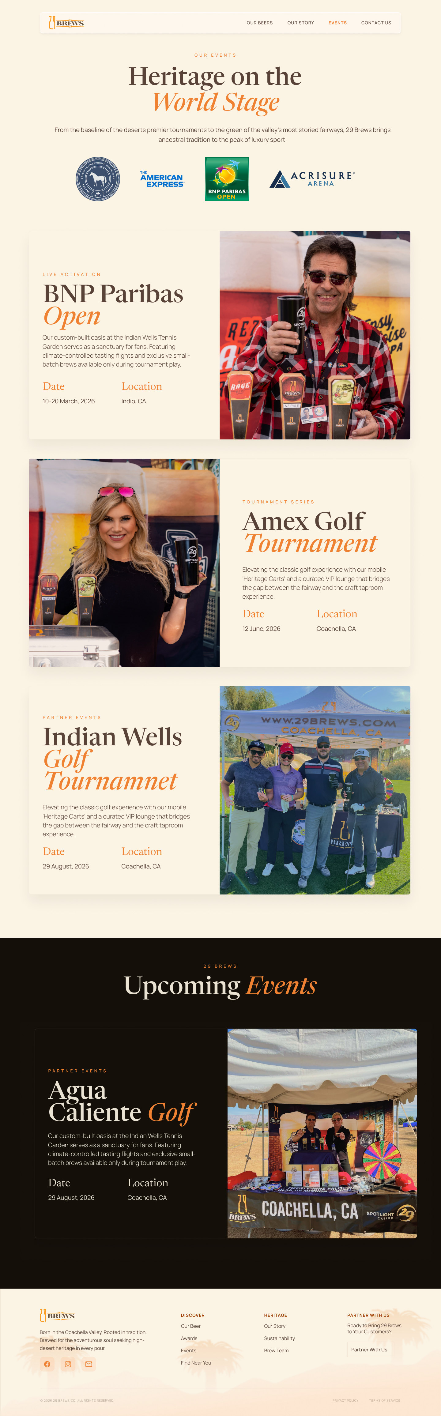
An events calendar and upfront hours and location inside the casino, to drive taproom visits.
Most visitors are on phones: large tap targets, readable text, optimized images, maybe a taproom QR menu.
Untappd ratings, testimonials and an Instagram feed to build trust and community.
Compressed images, alt text, contrast and keyboard support, and a Spanish-language option.
Each how-might-we question became a column on the board, and the ideas under it became the features of the new site.
Two sitemaps share one structure. Customers get Contact; partners get a profile with curated support. Switch between them to compare.
How each audience moves through the site, from first visit to the action that matters.
A warm cream and deep brown system with gold accents, built around the beer, the brewery and the people. Six moments that carry the research, then every page in full.
The first screen leads with the brand promise and the cans, with a single clear call to action: view the beers.
The tribal story sits right after the hero, so it’s the first thing people learn, not something buried on an About page.
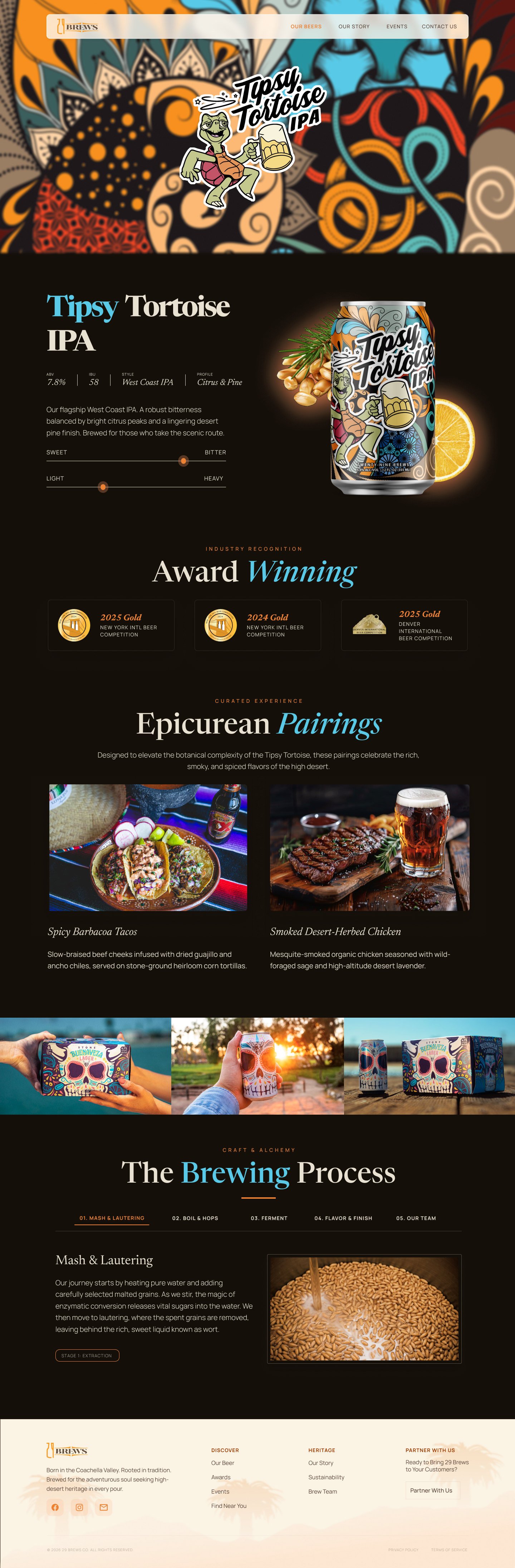
Style, ABV, IBU and flavor notes, plus sweet ↔ bitter and light ↔ heavy sliders, so anyone can pick a beer without asking staff.
Food from the casino’s kitchens matched to each beer turns a drink choice into a dinner plan.
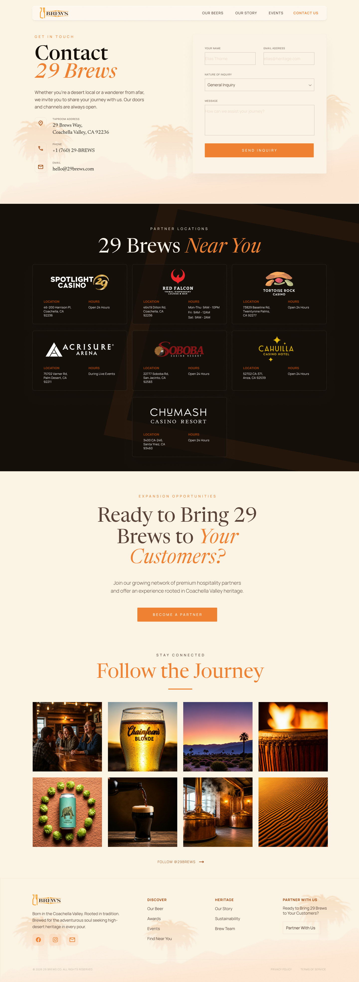
Every casino, venue and partner pouring the beer, answering the question people asked most: where can I get it?
Spent grain goes to local farms, a small story that sets 29 Brews apart from competitors with similar recipes.
Pick a page, then hover (or scroll) the frame to move through the full design.


Usability testing to see how people navigate the new site and spot any blockers before launch.
Creative direction, brand and website for a Nepal-based clean-energy group developing hydropower, solar and pumped storage, presenting a 500 MW portfolio to investors, partners and future hires.
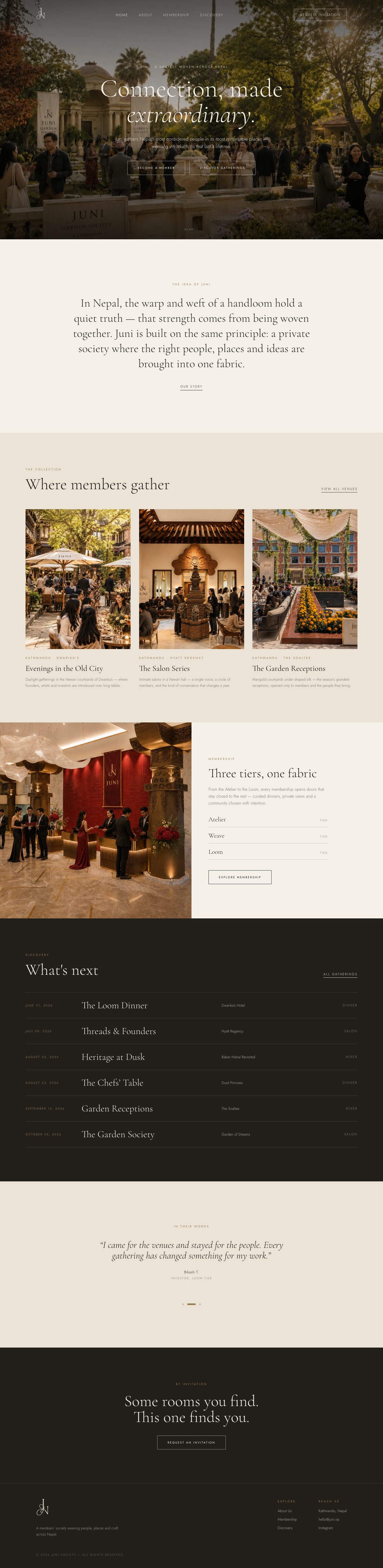
Brand, business strategy and website for JUNI, a private members' society for Kathmandu that brings the right people, places and ideas into one fabric through curated gatherings, tiered memberships and a collection of physical brand pieces.
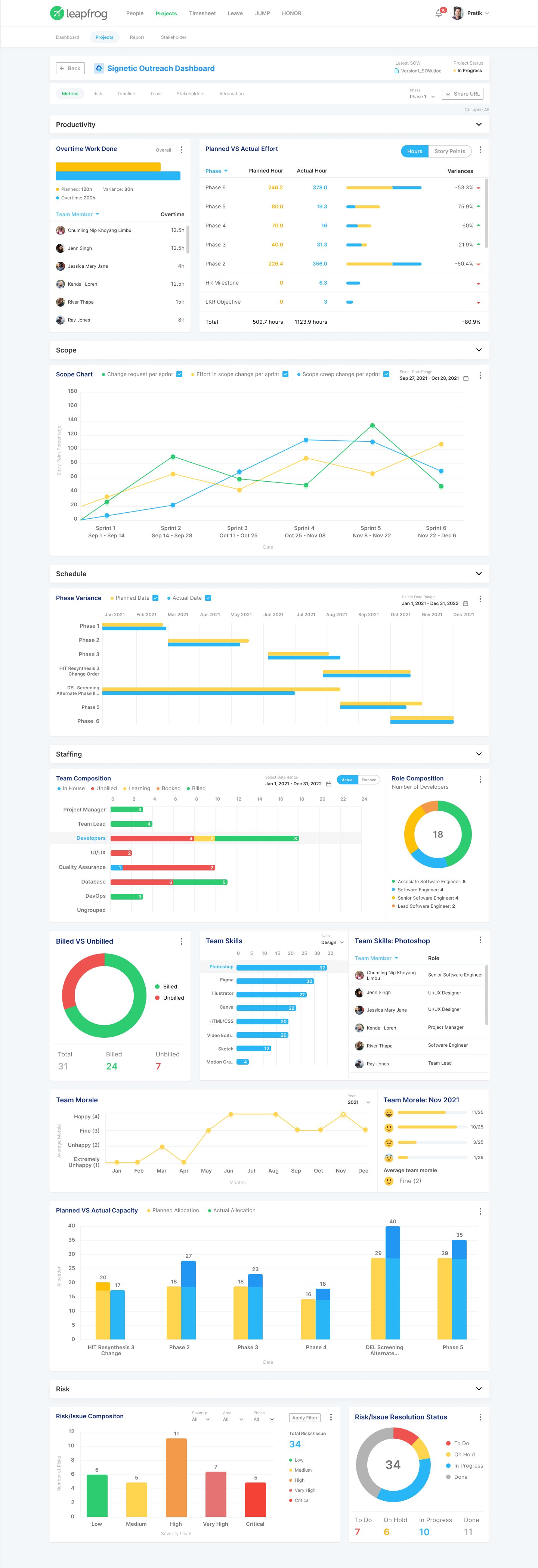
A platform that replaces scattered spreadsheets with intelligent dashboards. Executives monitor progress by project, managers understand how work connects, and teams stay updated. Converts messy project information into actionable insights, saves time, and keeps everyone on the same page.
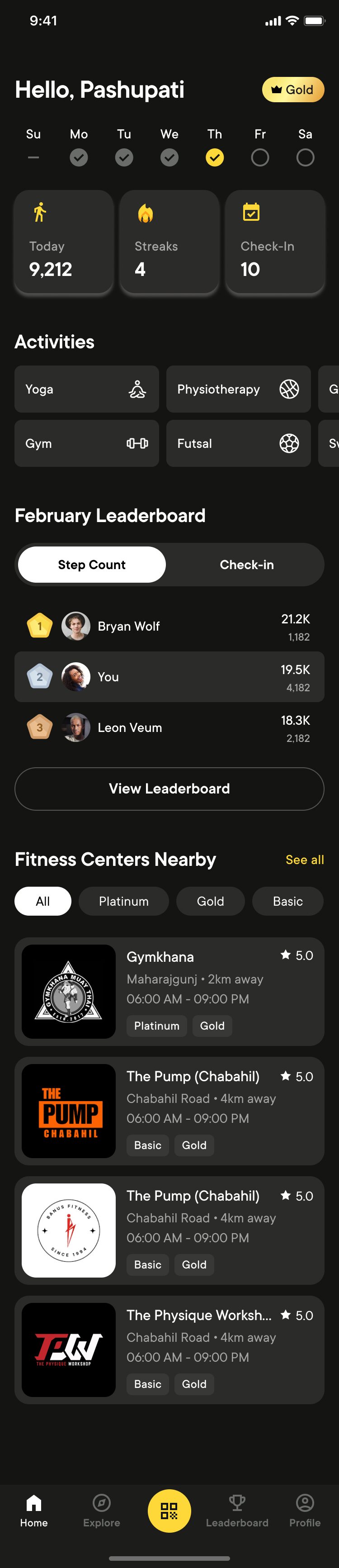
Meltdown is a digital fitness subscription that gives employees one QR code access to multiple gyms, offering multi-location access, reward programs, and community-focused team well-being sessions.