Meltdown: Your All-in-One Fitness & Wellness Companion
Meltdown is a digital fitness subscription that gives employees one QR code access to multiple gyms, offering multi-location access, reward programs, and community-focused team well-being sessions.

Figma
2 Months
Fitness Tech
UX Designer
Challenge
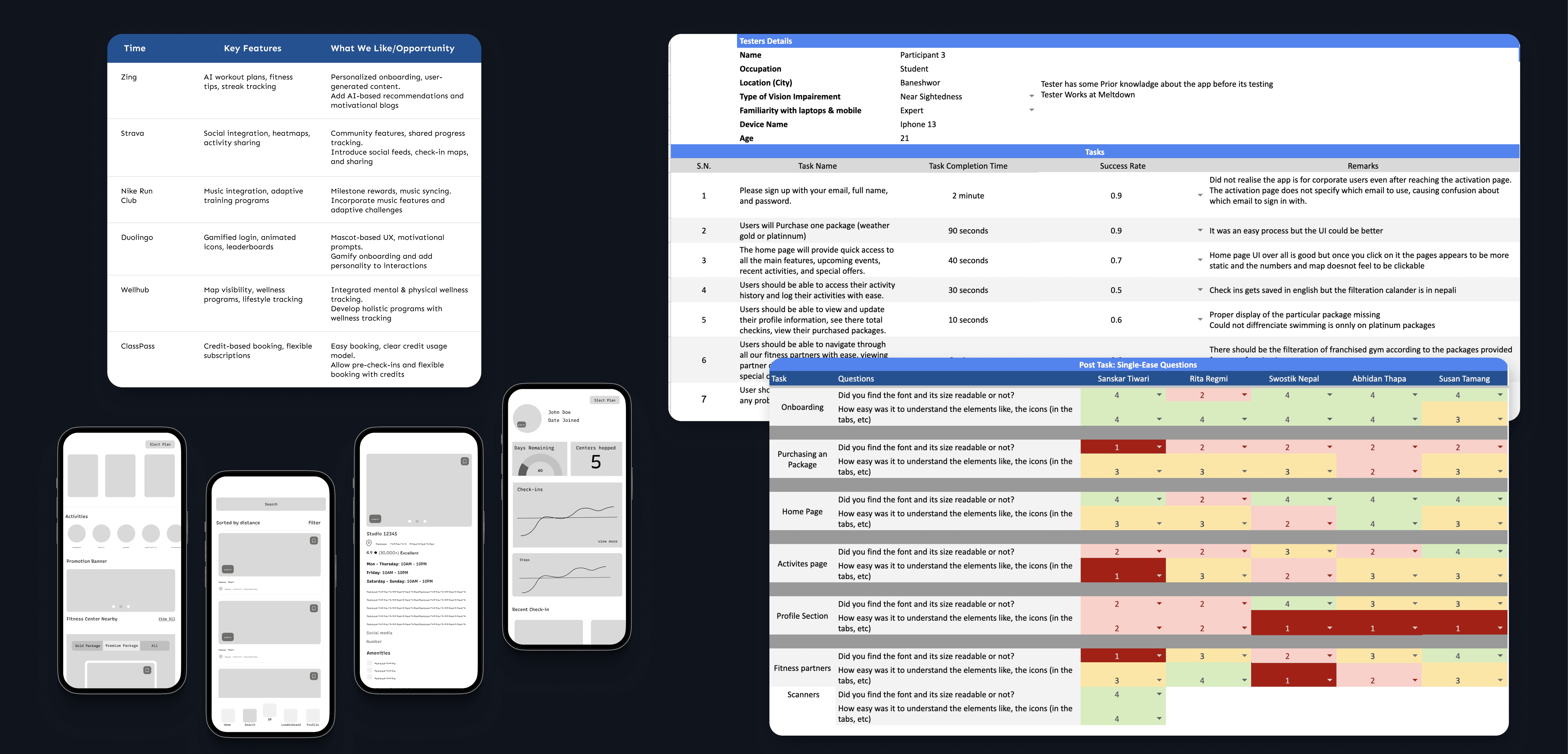
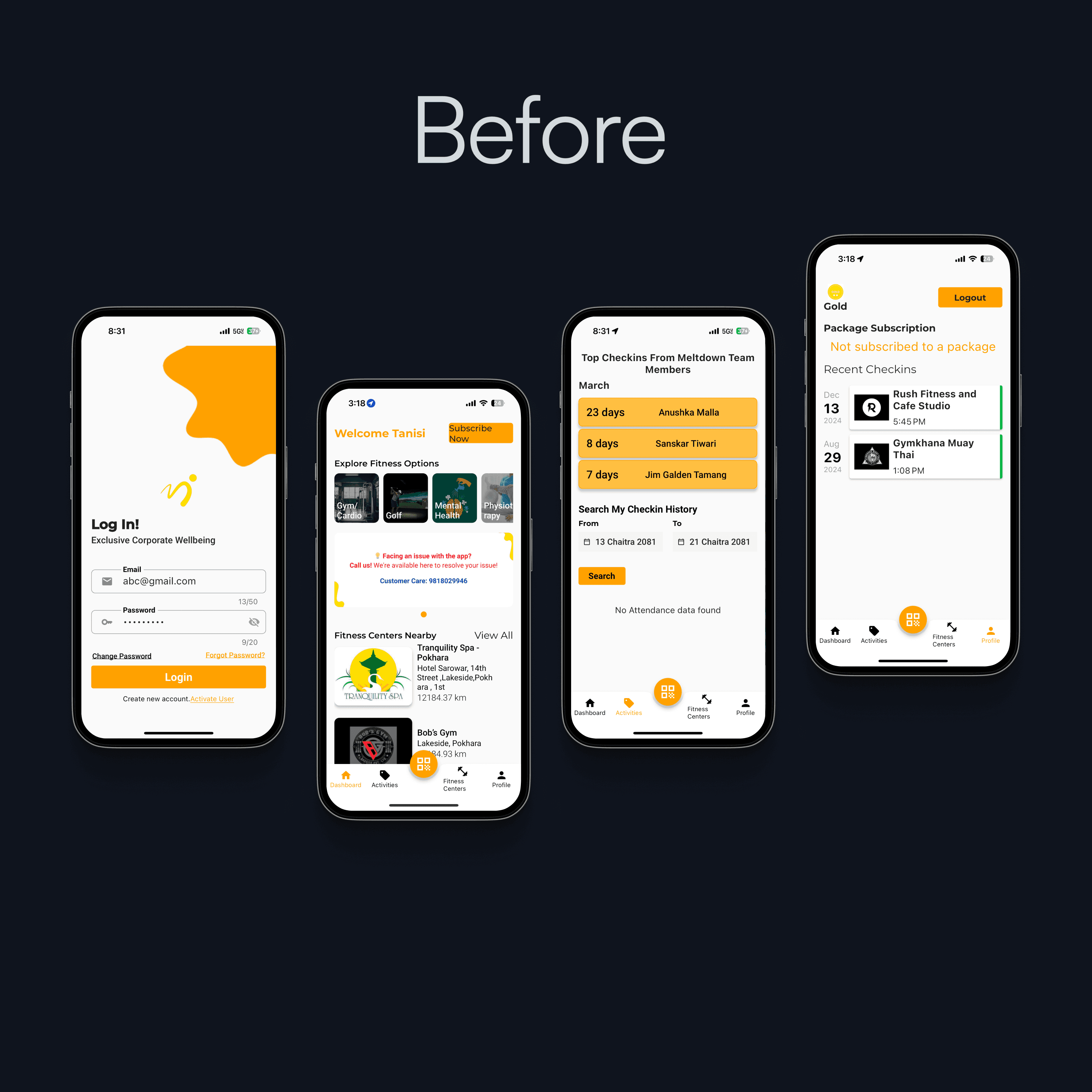
The Meltdown app faced several usability issues that made it hard for users to stay consistent with their wellness routines. Technical glitches during QR scans, inconsistent calendar formats, and unclear package distinctions disrupted the experience. The user interface lacked clarity, making navigation and interaction difficult, especially for new users. Additionally, the absence of a proper onboarding process and lack of gamified motivation led to low engagement. These barriers prevented users from fully embracing Meltdown as a daily wellness companion.
Results
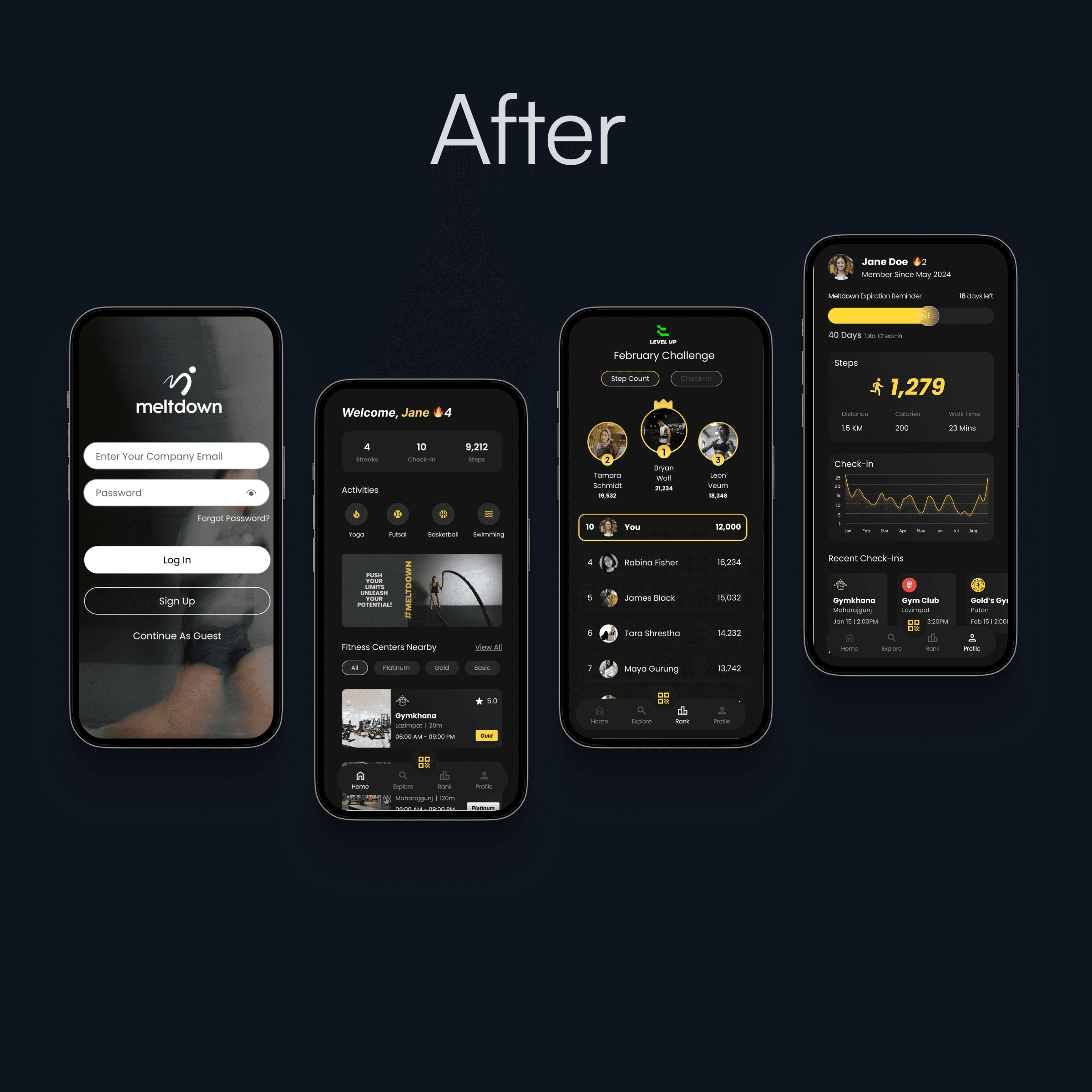
To overcome these challenges, Meltdown was redesigned to prioritize clarity, consistency, and engagement. A unified QR code system with real-time feedback simplifies check-ins. The new onboarding walkthrough introduces key features with ease. Subscription and profile pages now clearly display package details and benefits. Gamified elements like streaks, badges, and leaderboards motivate regular use, and departmental rankings boost community involvement.
97%
Navigation Success
2x
Faster Check-in
100%
Approved the premium feel

Process
Discovery
By testing on 5 users, we found that package choices were confusing and QR check-ins weren't consistent. Competitor research revealed that we were losing out on engagement. Premium feel was also desired by the client. We focused more on easier navigation, a refined UI, and interactive ways to keep users motivated.
Ideation
We explored a wide range of ideas, sleek visuals for package levels and how to make the experience more community driven. All of our ideas were subjected to hands-on usability and brand fit testing. Along the way, we refactored the app's architecture, navigation, and flow to make things simply work.
Create
Fixed the current problems including QR scanning, calendars, and navigation. Created a new design system. Then I added premium touches such as dark mode, personalization, and ranking. We had weekly meetings to discuss each feature with the product owner and the developers.
Measure
Pre-launch usability testing with 7 users shows an 97% success rate for primary tasks (vs. 70% previously). 100% described the premium UI as "intuitive but elevated." Performance metrics show 2x faster QR scanning. Final analytics deployment will track engagement KPIs at launch.